AIGA Chicago
-
Tools


I redesigned AIGA Chicago's mentorship site to combat high dropout rates.
AIGA Chicago's mentorship platform connects designers at all experience levels. I redesigned their program website to reduce the high number of mentees who dropped out.
Major milestones included:
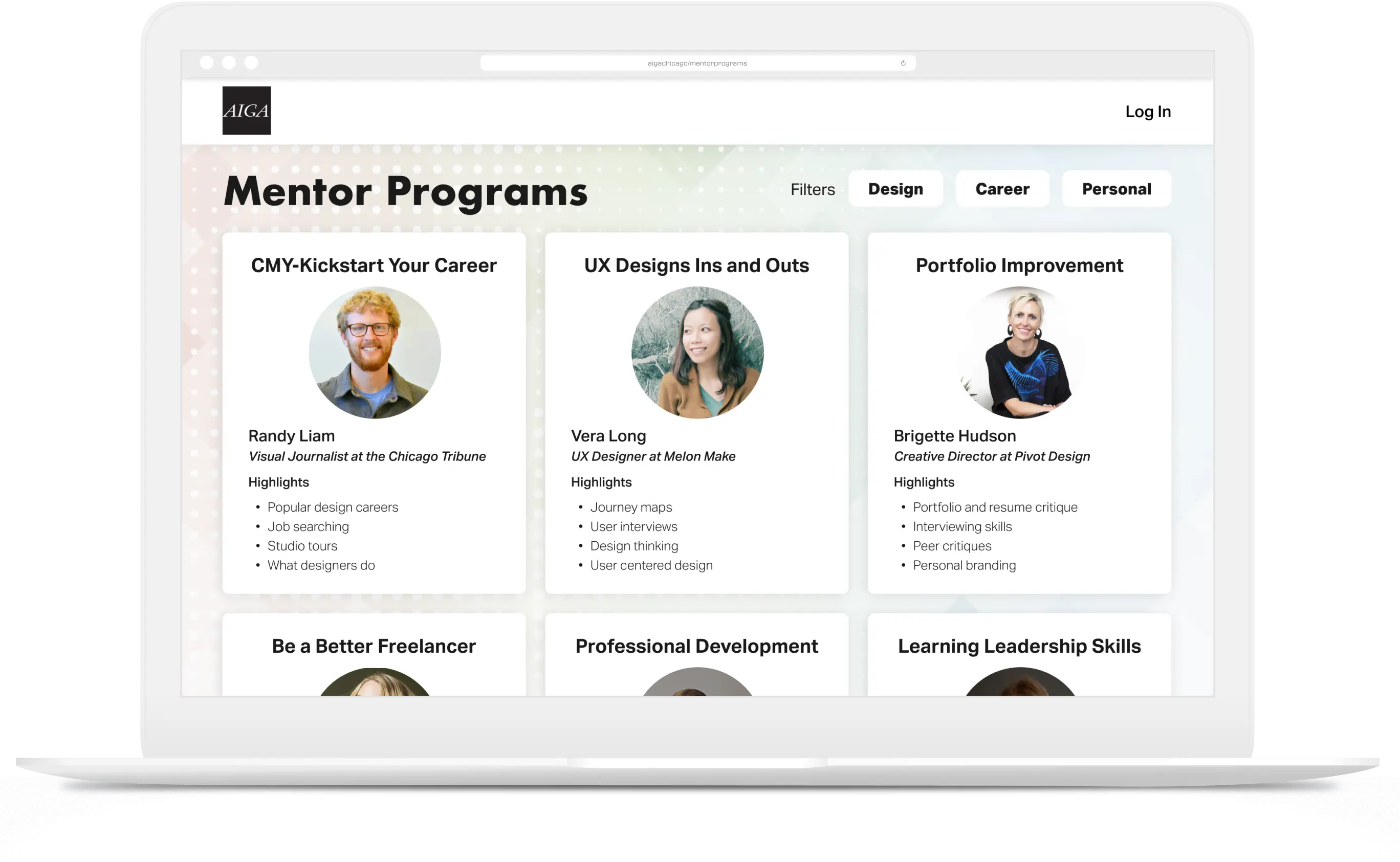
AIGA Chicago's mentorship program connects professional designers to share insights and build relationships. AIGA contracted our agency, Designation, to rebrand the program and design a website for mentees to browse groups and connect with other members.
I worked through 3 single-week sprints to redesign the site. We worked directly with our creative director, using daily stand-ups and weekly presentations to prepare a final prototype demonstration for AIGA.
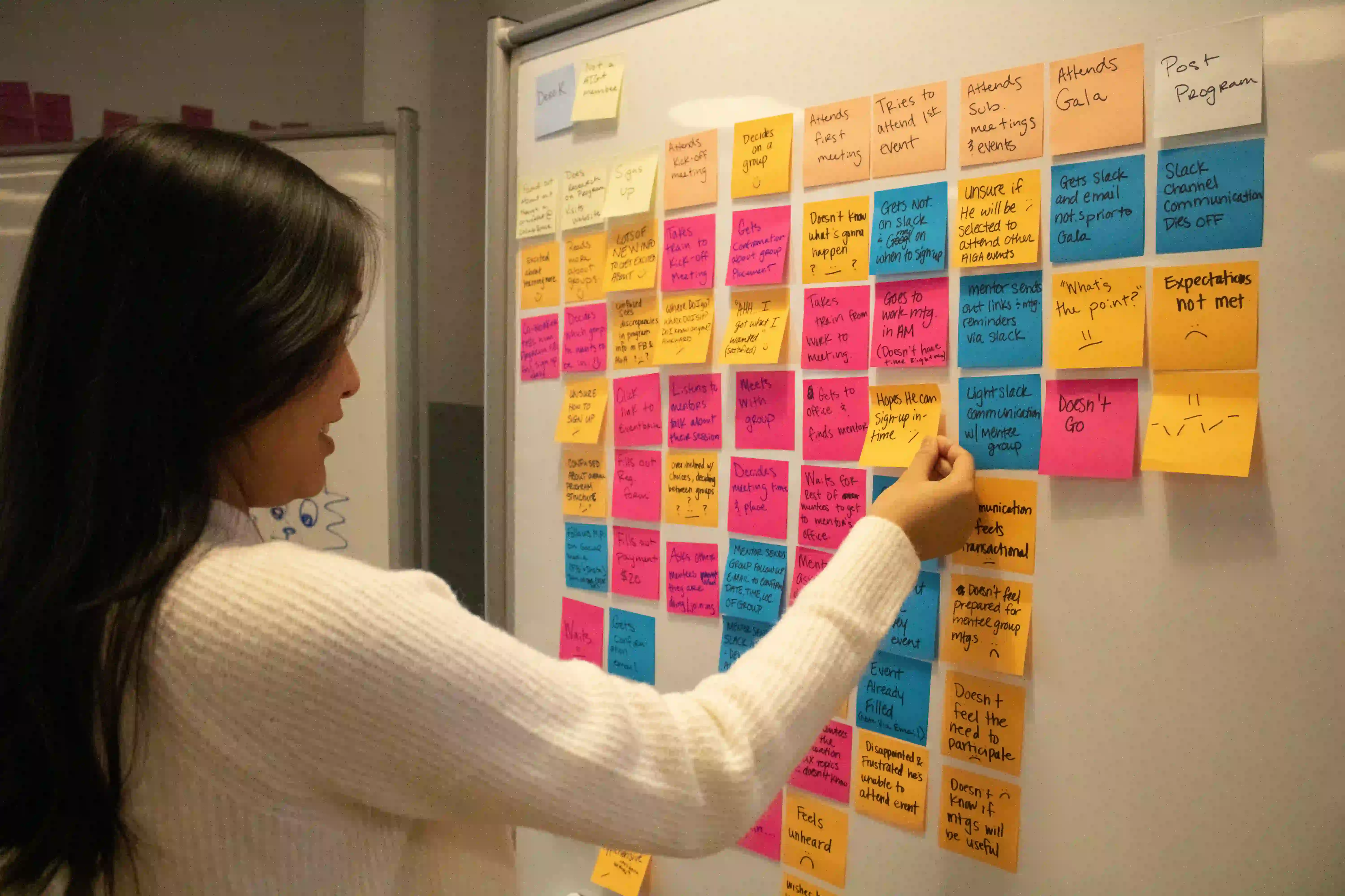
Our research team handed off the project after completing discovery.
Our client, AIGA, was concerned with the high mentee abandonment rate. Interviews revealed that mentees left due to uninformed expectations and a lack of communication. They often needed clarification about meeting dates and how to connect with mentors.
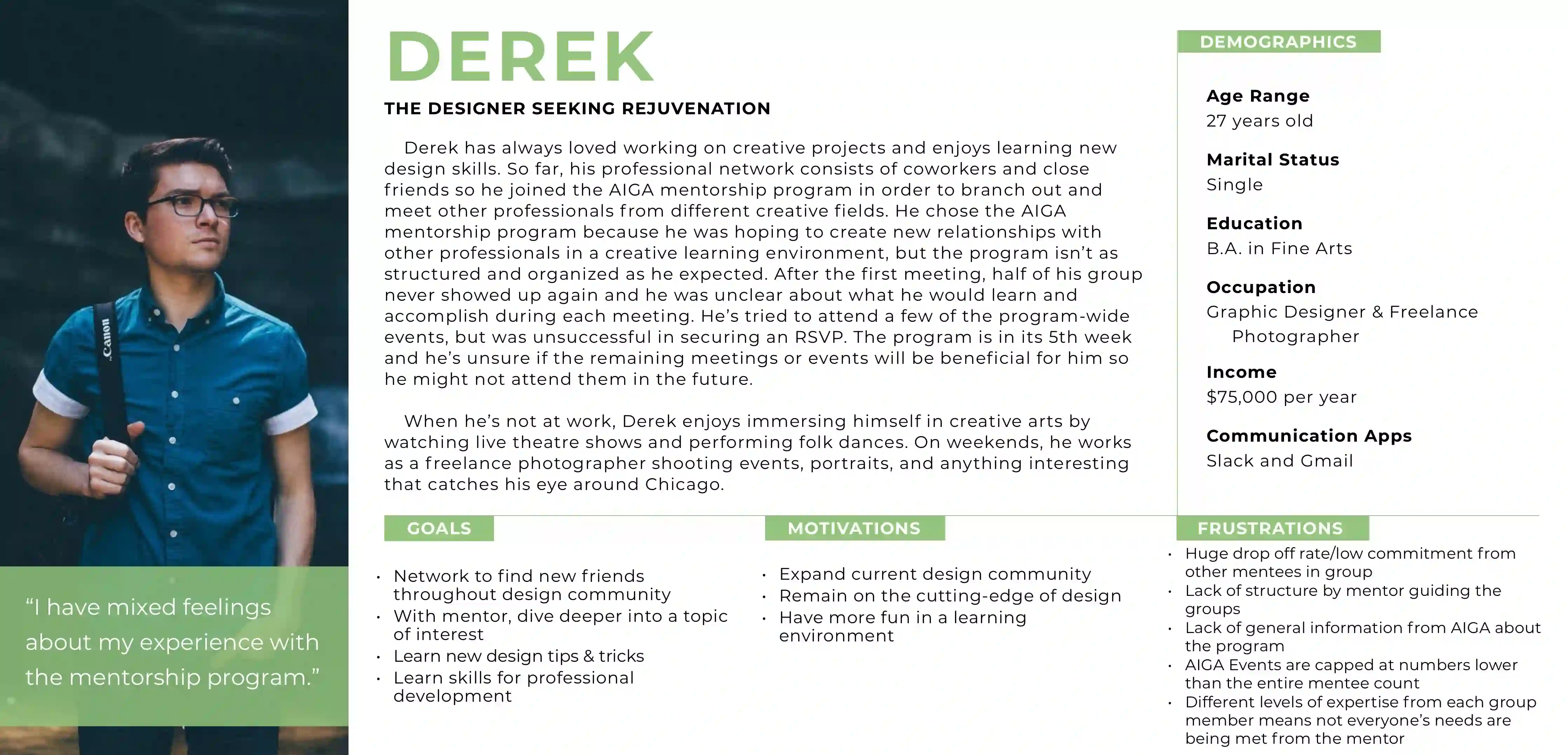
Reversing dropouts required us to understand the struggles of mentees.
Our mentee user persona, Derek, concentrated our efforts on addressing the problems that participants faced. We translated their process into a journey map that emphasized the highs and lows of their time in the program.
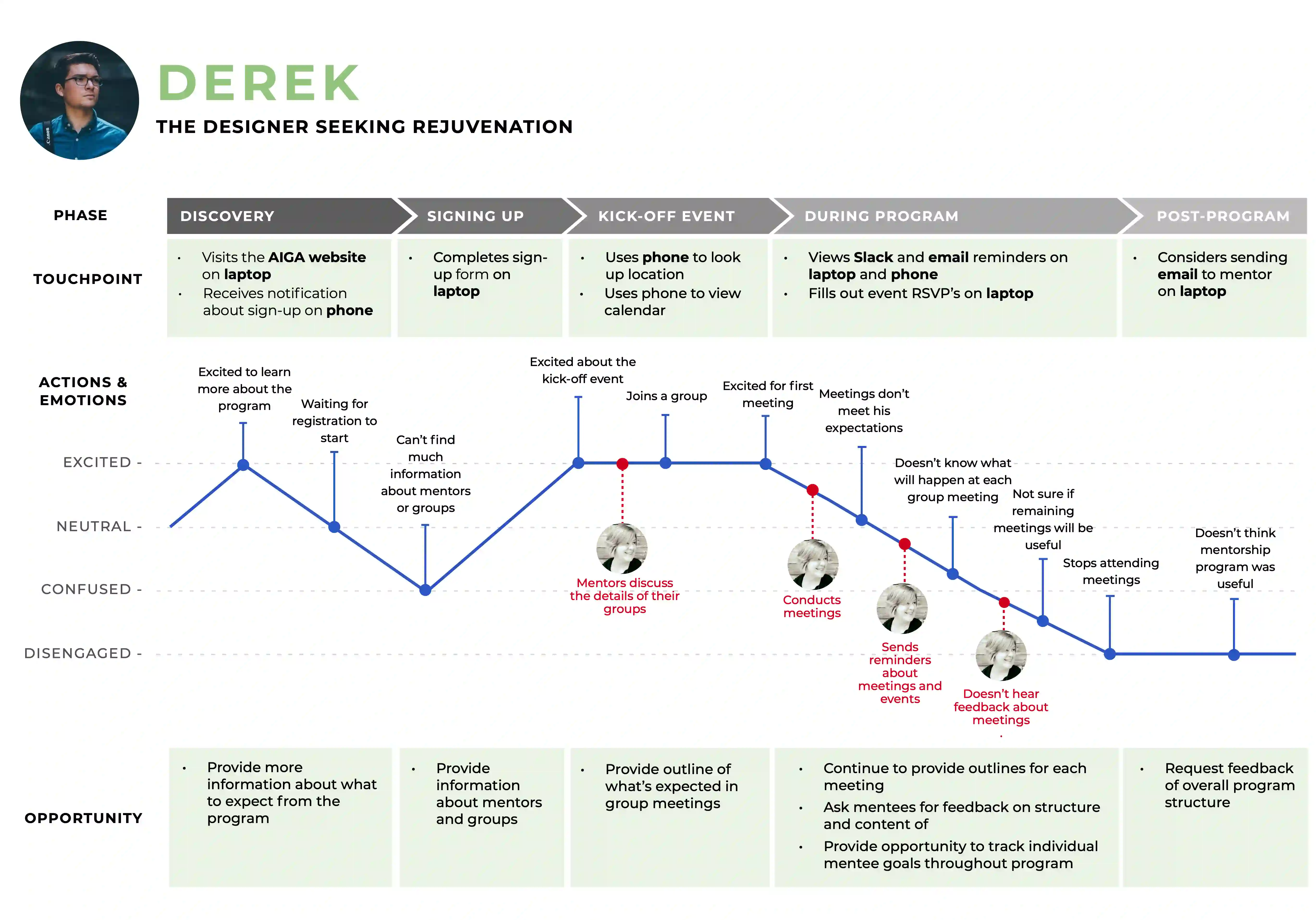
Journey maps highlighted major milestones in mentee engagement.
After getting to know our audience, I explored similar experiences. My competitive analysis involved direct and indirect competitors, ranging from mentorship to online learning platforms.
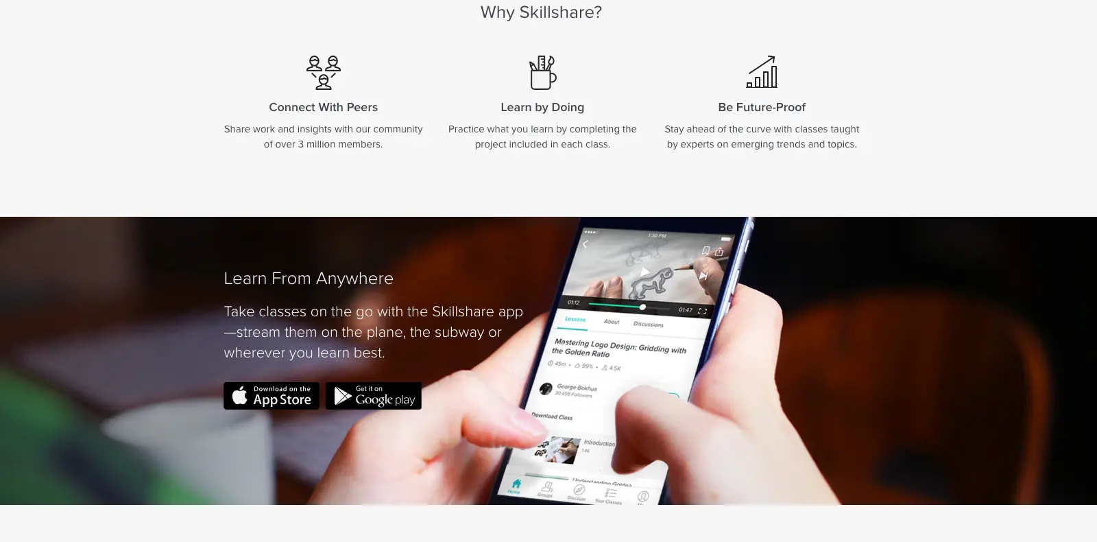
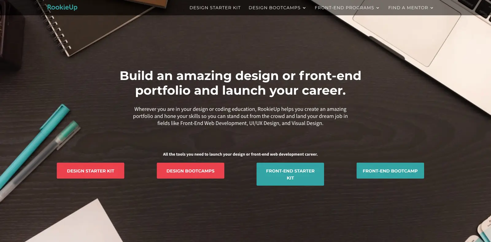
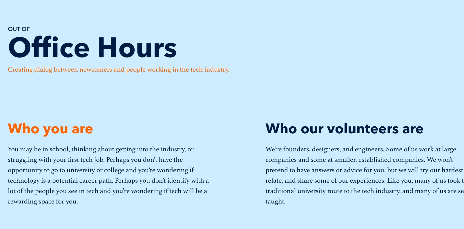
I investigated competitors like SkillShare, RookieUp, and Out of Office Hours.
Our analysis recognized that existing experiences were thoughtful but missed the need for connection. Mentors and participants needed photos or contact information, missing ingredients for a community.
Our findings provided clear direction on improving the experience for designers like Derek. Research synthesis led our team to define three design principles for our mentorship platform.
Mentees professed that trust was the critical first step in engagement.
The heavily styled website felt over the top for mentees just looking for class updates.
Helping mentees quickly find pertinent information required improved transparency.
The prominent theme of our interviews was the difficulty of quickly checking course information, especially the class schedule. Tests showed that previous wireframes felt overwhelming, with too much data shown at once.
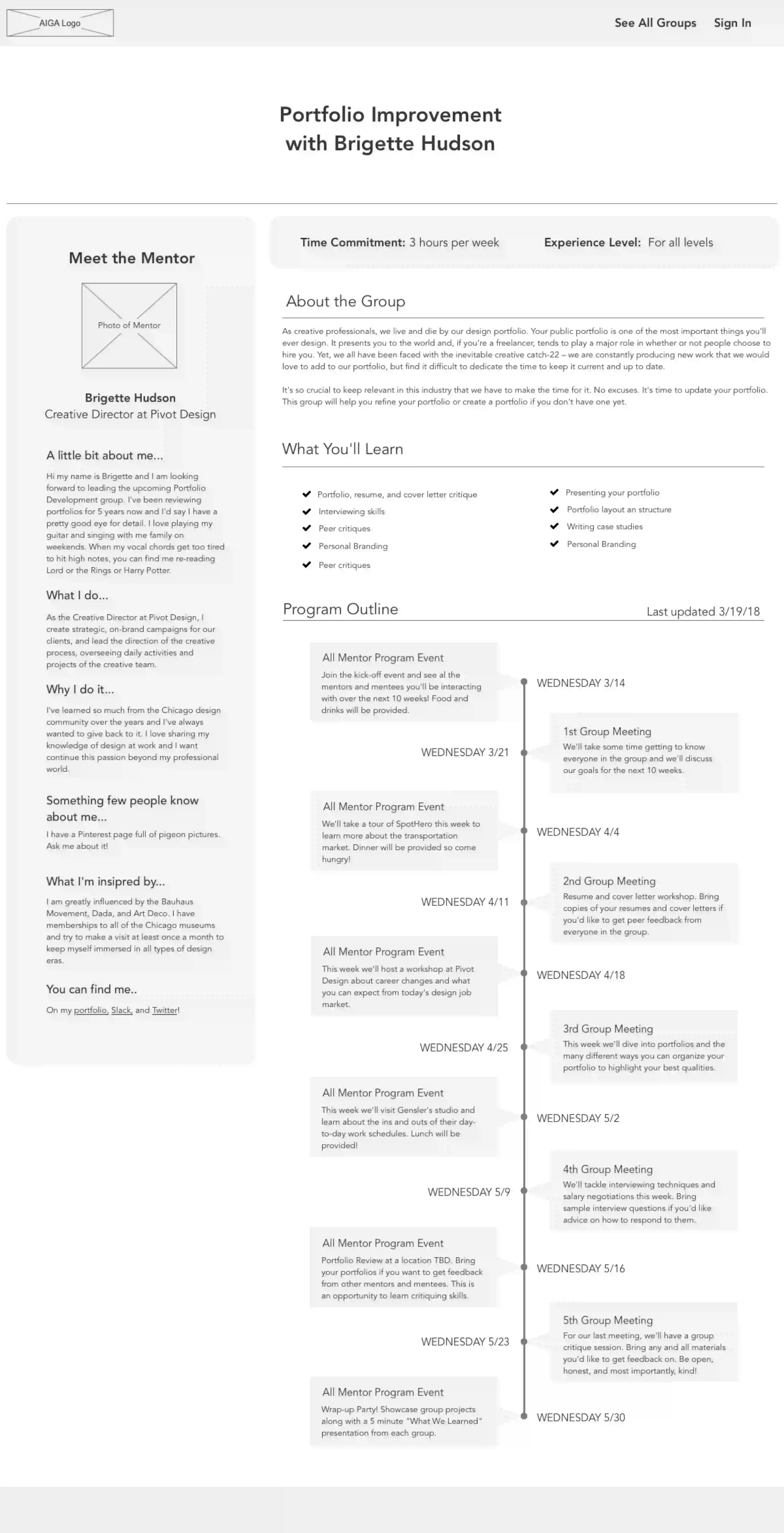
Previous wireframes drowned in program info, overwhelming mentees.
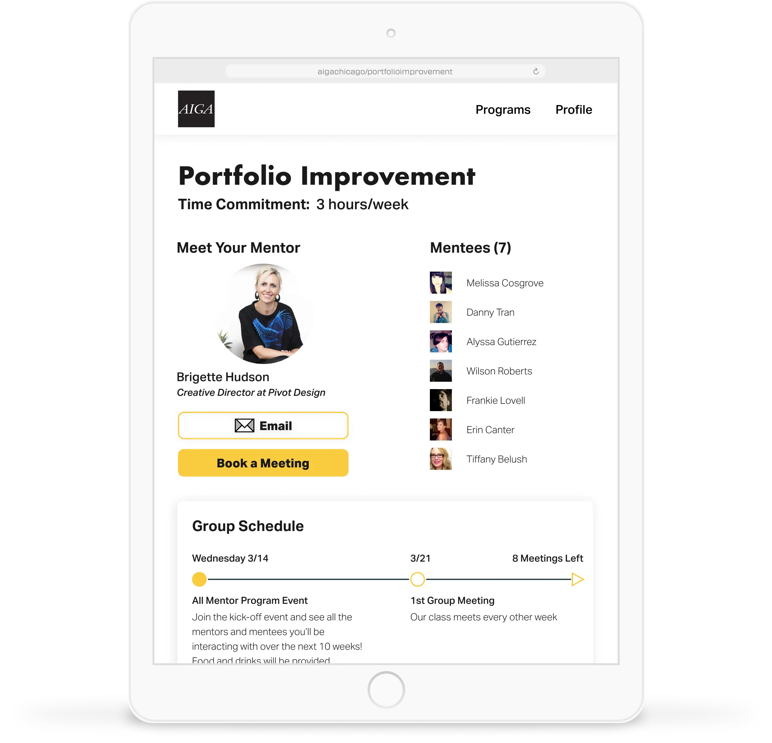
I prioritized critical information like class expectations and schedules, presenting them at the start of the page instead. I also introduced collapsible elements that helped users focus on what they wanted to see. The result included a dramatic reduction in clutter and improved progressive disclosure.
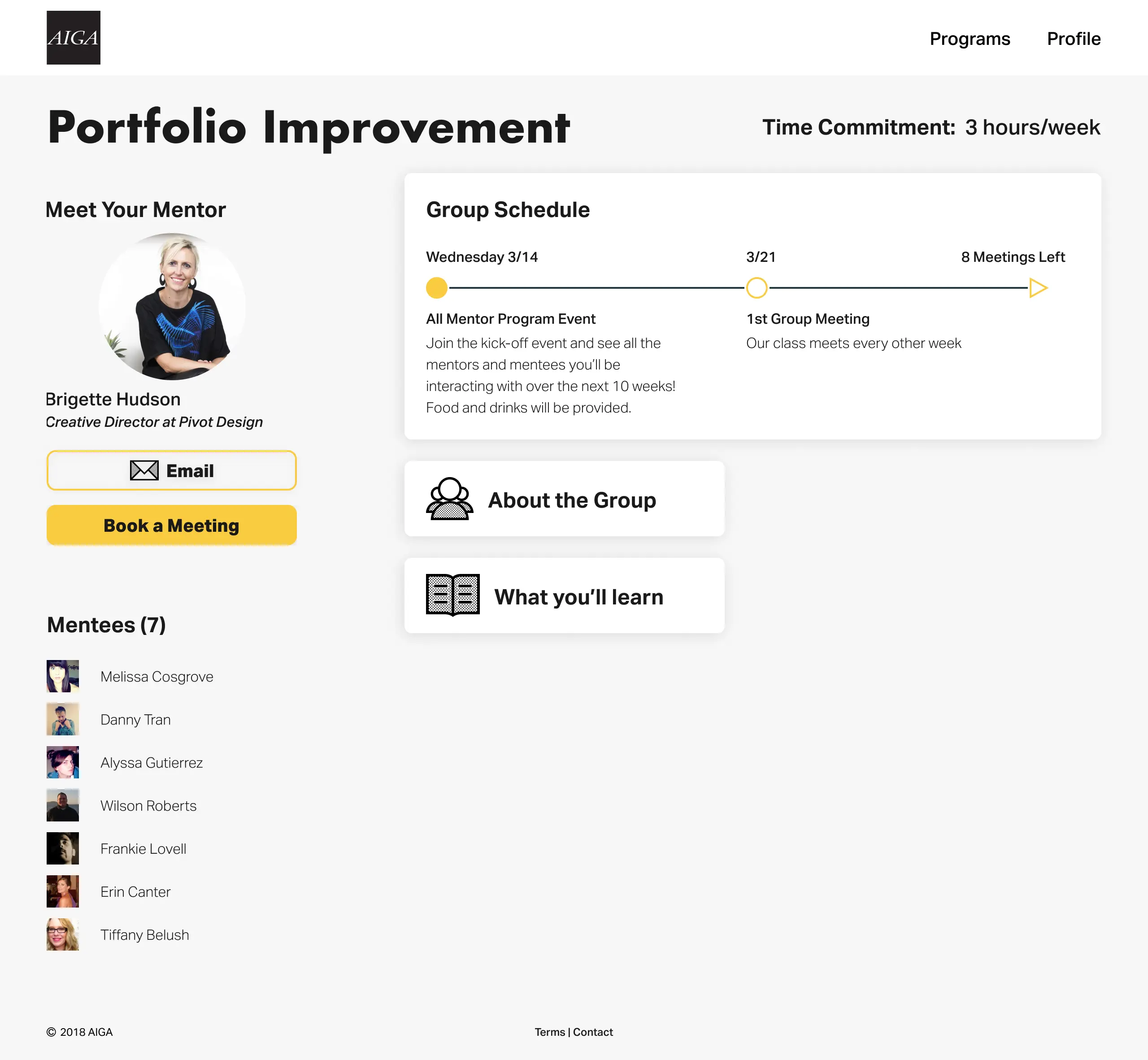
The updated design prioritizes critical information to bring clarity to mentees.
Next, I simplified the meeting schedules. Showing details of every event at once intimidated our users, who often stopped attending once they missed a meeting. Focusing on the immediate meetings kept the current agenda in plain view.
The new design helps mentees quickly find the information they need to stay in the know.
I tested the updated prototype with users for usability and desirability. Our team measured the success of our solution in line with our design principles.
Seeing mentor photos and specialties made it easier for users to find classes they were interested in.
Testers reported the new design more focused than the over-designed feel of the old site.
Our AIGA mentees loved the straightforward timeline and found it easier to digest the different sections in my design.
I presented my design process and solution to our client, providing several deliverables, including a prototype and style guide that would serve AIGA Chicago in reforming the program in the future.
This project was crucial to shaping how I articulate my design rationale. I made sure to root design directions to research and base my reasoning on user insights.
My work sparked an ever-present enthusiasm for testing and user advocacy. I learned to challenge assumptions and communicate design efforts succinctly. Today, I make it a point to start with data and rally design work on research findings.